Introduction
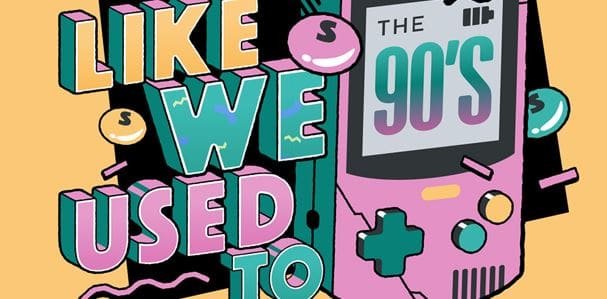
There is no doubt if we call 90’s the best decade of our lives. Life was so much simpler, yet evolving back then. The World Wide Web started spreading all across the world, making internet accessible to a larger group. The main source of entertainment in that time was still the televisions, magazines, newspapers and billboard advertisements. The concept of digitization was yet to appear in its full glory.
Brands were still focusing on making logos that appear exotic and bright in color to grab more attention from the public. Many brands used computer generated imagery (CGI), InDesign and Photoshop by adobe to bring revolution in their logo designing.
Recommended reading: How Can I Make A Career In Web Design?
The beginning of change
The society began to swift into the digital era in the early 00’s. when MTV channel came, it made several changes to its logo in order to deliver its cool vibe and edgy branding across television. Later, the internet also helped many logo design companies Dallas use the latest technologies and better designing skills.
Since new technologies like the internet and CGI were being introduced, designers used everything. Remember the Google’s logo with a shadow?
With passing times, people started to use these technologies on regular basis and became more familiar with it. The excitement of using all the designing elements in a single logo started to get dimmer and dimmer over the years. The logo design companies then shifted from three dimensional designs to two dimensional logos, as known as flat designs.
Moving towards minimalism
Although jumping from 3D to 2D might sound like a downgrade for logo designing industry, but it worked out alright. Flat designs are more minimal and use lesser styling elements like texture, gradients highlights and shadows. Even Google dropped its ‘Shadowed’ logo and opted for a simplicity. As the time changed, the definition of modernity also changed with it. What was considered modern and up-to-date before changed into redundant and overly used. The minimal and flat designs gave the logos a cleaner and modern feel. As a result, many popular brands and companies toned down their overly designed logos.
Since we have now transitioned in to a new decade of 2021, the flat logos are on it ways out.
Recommended reading: How to Start a Successful Freelance Graphic Design Career
New trends for logos
The whole landscape of logo designing world has drastically changed from 90’s till date. Now, the current and future logo designing trends are more innovative yet maintaining minimalism. We have created a list of the most popular logo designing trends now.
- Stained glass: Sounds mind boggling right? But believe it or not, stained glass logos are on top of our list of trends. And why wouldn’t it be? It is a beautiful design to work with. It takes your mind back into the history of gothic churches with stained glass paintings. Most of these designs are abstract and with minimal details. These logos look better with shards of colors, giving an appearance of reflection.
- Perspective drawing logo: The logo designs with a touch of perspective are on second place in the list of trends. The approach of creating a perspective logo is becoming popular in 2021. With simple linear design and angles, illusion and depth can create such an impactful logo, and it is a prove that you don’t need to add excessive elements to make a powerful statement.
- Geometric logo: The use of simple shapes like circles, ovals, triangles and square in a logo is one of the new trends in 2021. Keeping things simple, the designers use simple geometry to make their work easier. One of the benefits of using simple geometric shapes as a visual design and element is that you have the liberty to go bold and more expressive in terms of text and colors.
- Portraiture: When we mention there is no limit for creativity in logo design, we mean this. KFC has been using a self-portraiture as a logo for decades now. And people have Colonel Harland David Sanders’s face in their subconscious minds (even though he died in the 80s). That is how impactful a Portraiture logo is. Logo designers are using this design method because it creates brand recognition on a different level, and faces have a deeper connection with people, emotionally.
Recommended reading: 7 Ways to Improve Online Shopping Experience
Endnote
The bottom line is that logo designers’ point of view has changed massively over the last 30 years. The excessive use of adding every element at hand on logo designing is not going to work in the future. If you wish to create a more relevant and futuristic logo, opt for minimal designs
This post was created with our nice and easy submission form. Create your post!


